- Client: Studio concept
- Sector: Real estate (fictional)
- Year: 2026
- Services: Web design, development
- Format: One page
City Arcade
City Arcade is a real-estate agency that does not exist. We built its website as a studio piece: one page that shows how a property brand can feel modern and trustworthy at once, without a single stock smile or a search bar wall.
Property sites are the most copied category on the web. This one was made to answer what an agency could look like if it started from the buildings rather than the listings.
Overview
Agencies come to us asking for the same site: a search bar, a grid of listings, a team page, and a promise of trust that every other agency makes in the same words. We wanted a piece to show them before that conversation, so we invented a client and gave it the site we would argue for.
City Arcade is that client: a modern agency for homes, apartments, rentals and investment, with a short line of projects across Europe. The agency, its figures and its projects are fiction. The design, the build and the motion are exactly what we would ship.
Who it is
A fictional modern real-estate agency: homes, apartments, rentals and investment, with digital tools and local knowledge.
What we gave it
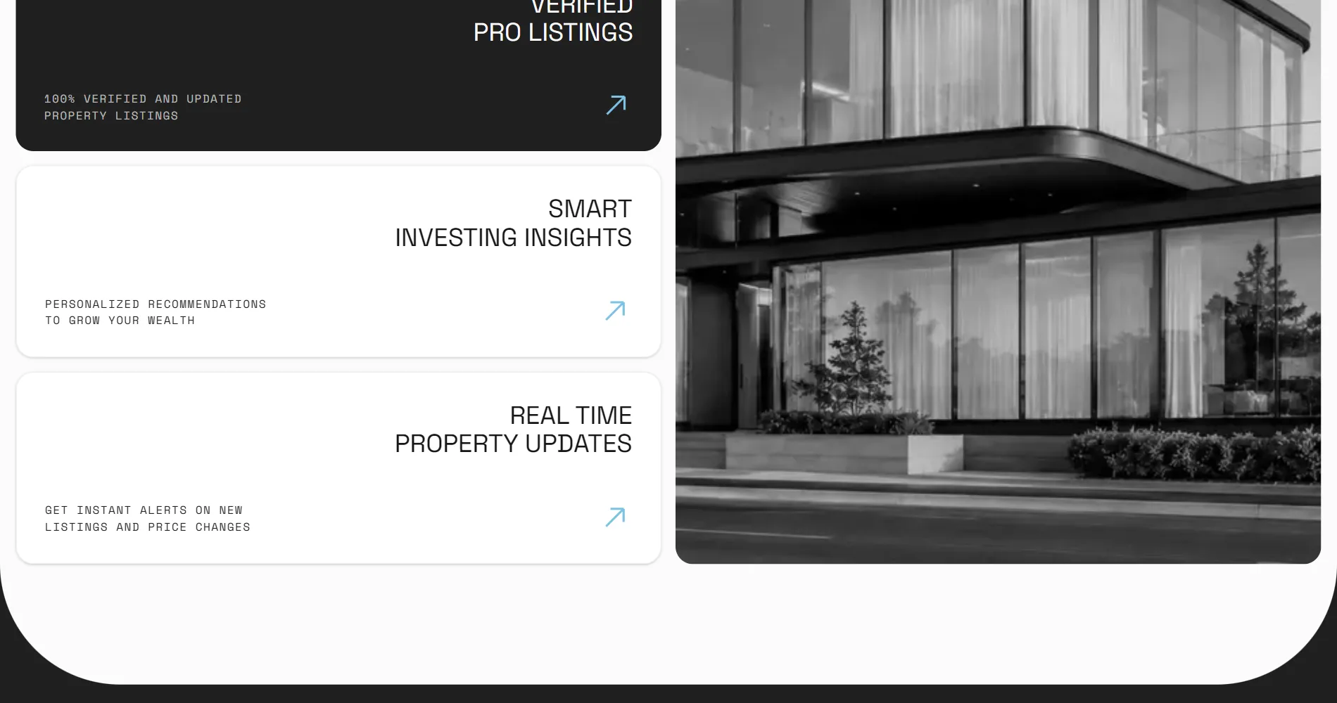
One photograph of a glass building, a name, four services and three invented projects to show.
What it had to show
That a property brand can lead with architecture and still read as calm, verified and safe to call.
The problem
Real-estate sites compete on inventory and look identical because of it. The listing grid is the product, and the brand is whatever colour the header is. A buyer remembers the house, not the agency, and the agency is the one thing that wants to be remembered.
The brief we set ourselves was to make the agency the first thing you see and the buildings the proof of it, on one page, with nothing a visitor has to learn before they understand who this is.
Design concept
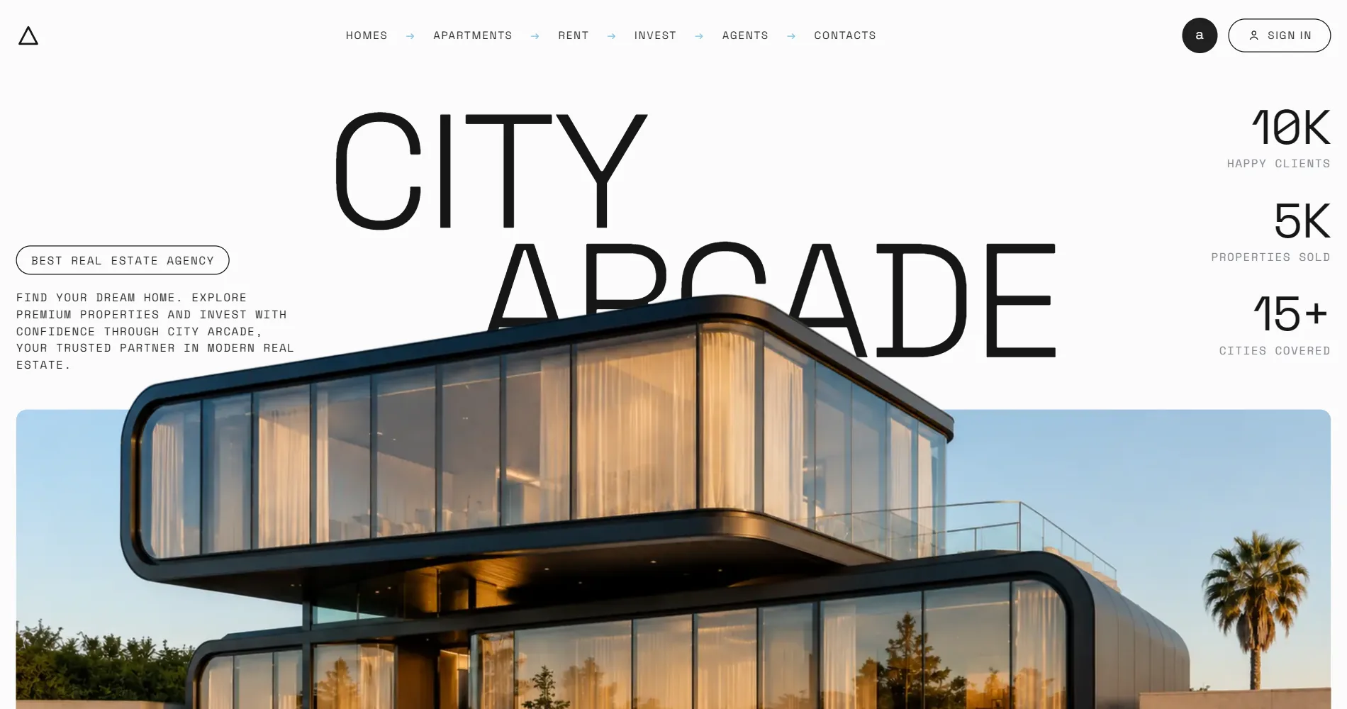
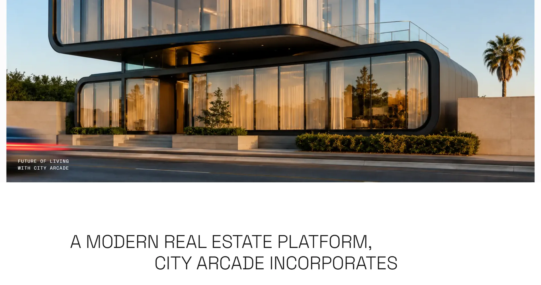
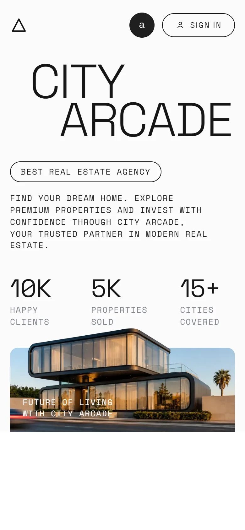
The concept is the building breaking out of the frame. The name is set huge in two staggered lines beside a rounded photograph of a glass building, and as you scroll the frame opens and the building rises out of its own picture and over the type.
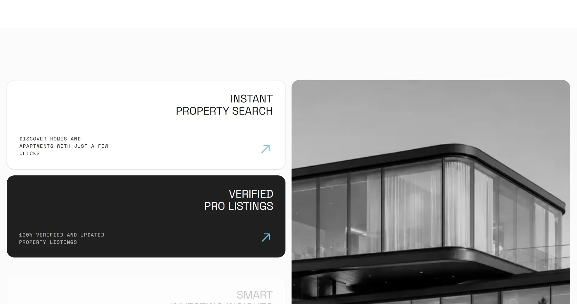
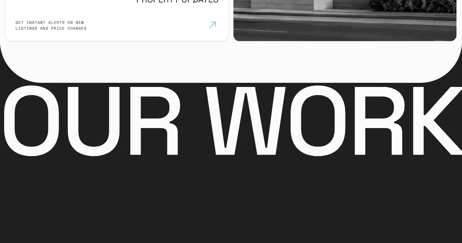
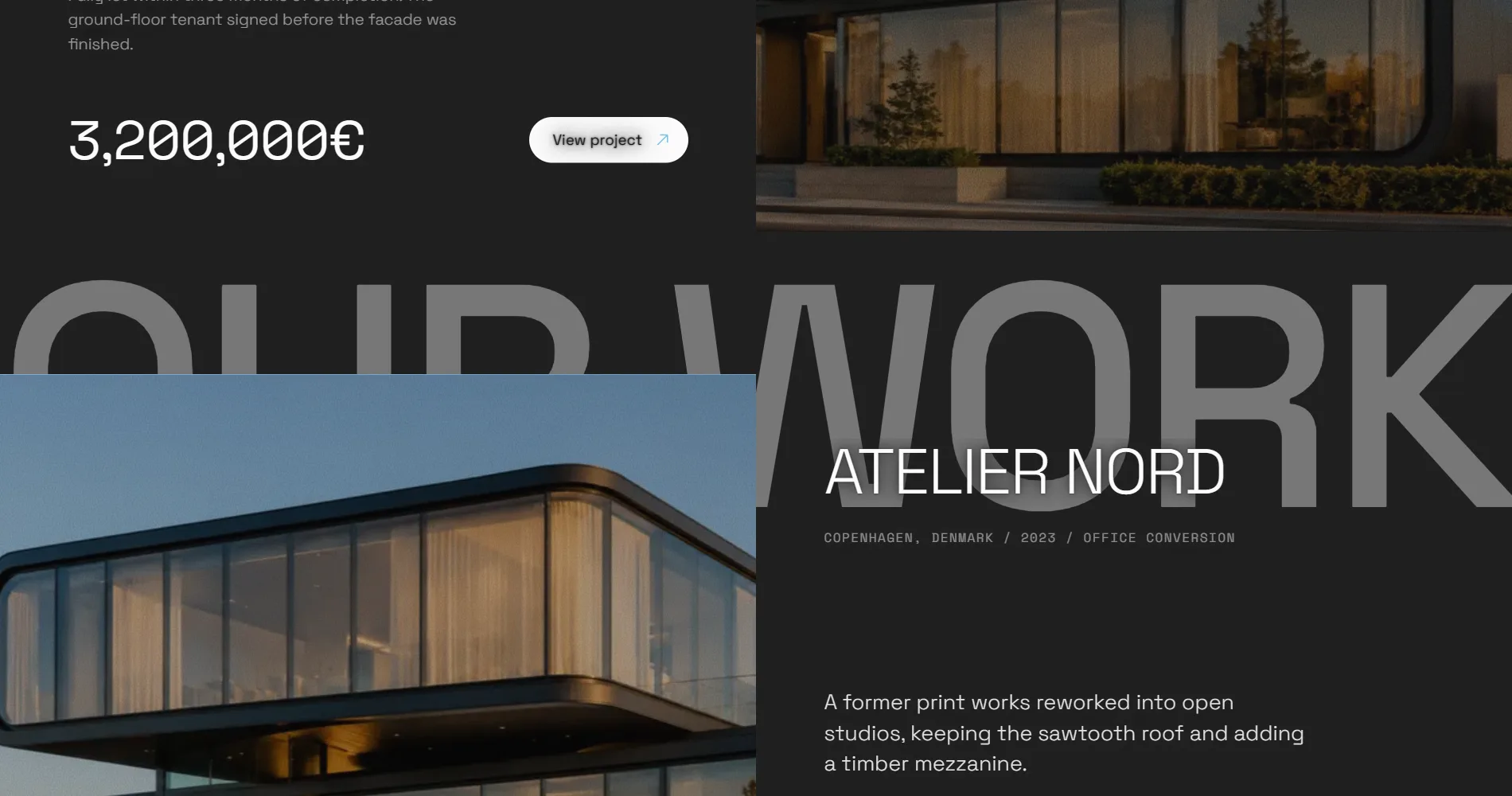
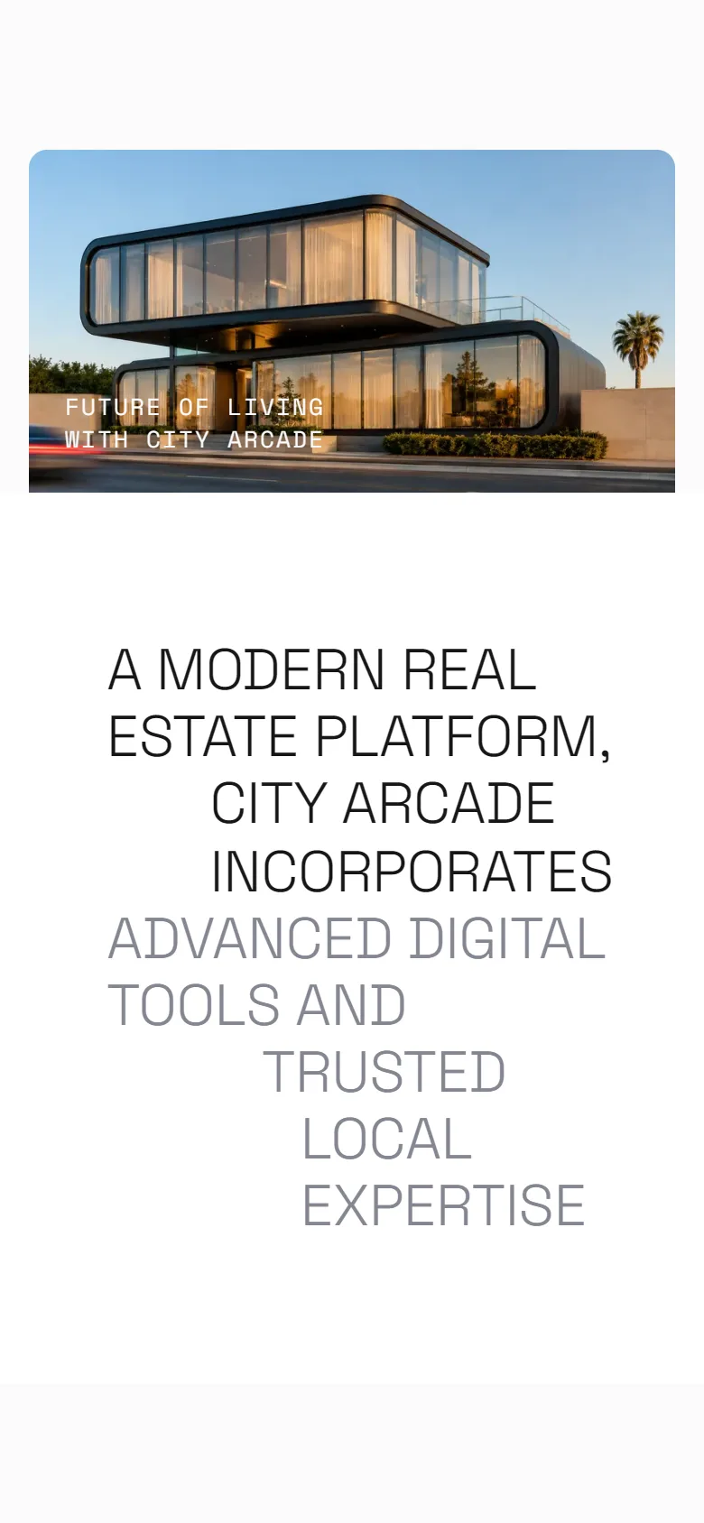
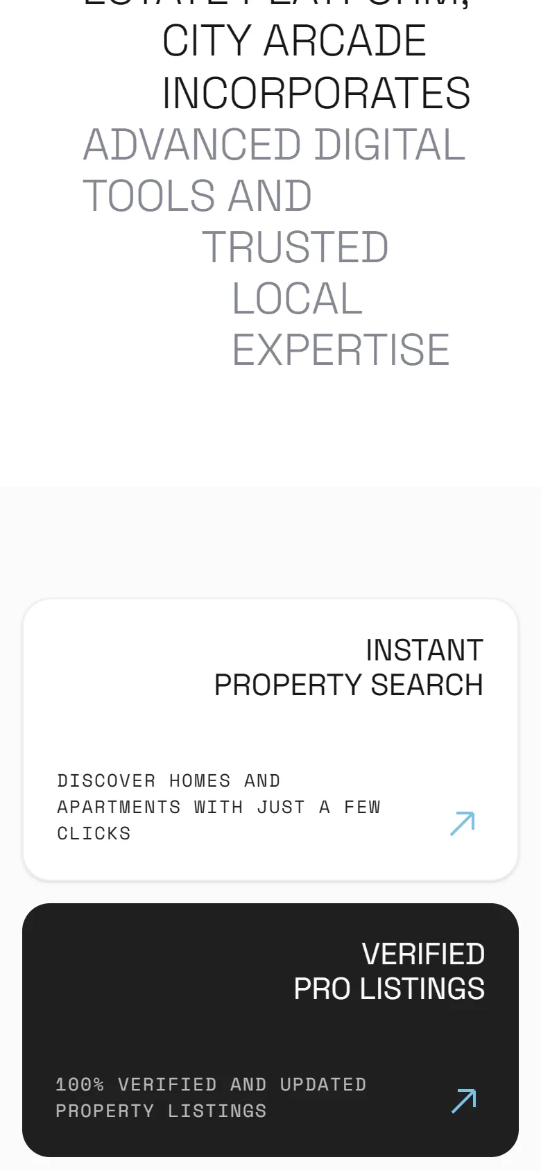
The rest is near-monochrome: paper, ink and carbon, with a single sky blue on the arrows. A grotesque for the display type, a mono for the labels. A statement in two tones, four feature cards beside a grey photograph, and then the work, on carbon, under a title as wide as the screen.
Out of the frame
The full photograph sits in a rounded frame; a cut-out of the building on a taller layer above it rises past the frame’s edge as it opens.
One accent
Ink, paper and carbon, and one sky blue reserved for the arrows, so every direction on the page is the same colour.
The work over its title
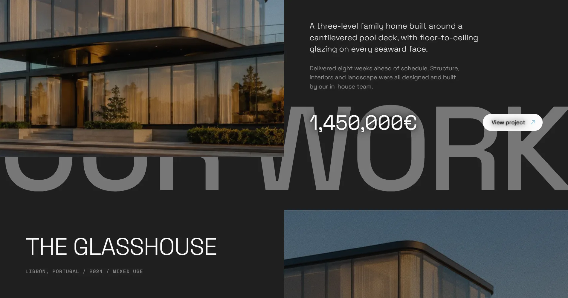
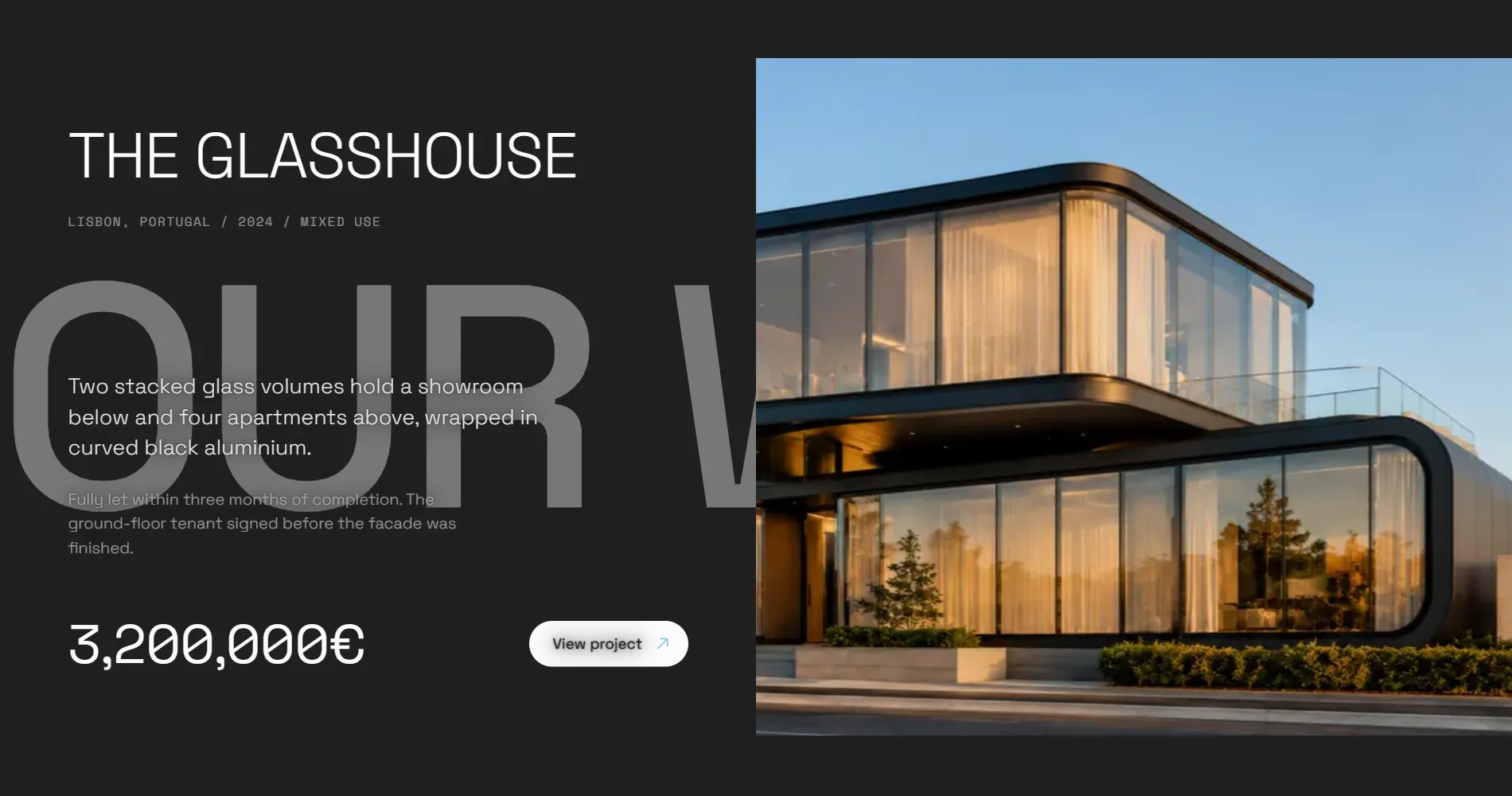
A pinned OUR WORK sits behind the projects, which slide across it and dim it as they pass.
Development
A Next.js page, server-rendered, with GSAP and ScrollTrigger for the scrubbed moves, Lenis for the scroll on GSAP’s own clock, and Framer Motion for the cards. Every move checks for reduced motion first, and the page reads complete without any of it.

One clock
The smooth scroll runs on GSAP’s ticker, so the scrubbed hero, the parallax and the pinned title all read the same scroll position on the same frame.
The frame opens
The hero frame is a clip-path scrubbed outward while the heading drifts up, so the building and the name trade places as you scroll.
Projects wipe in
Each project row opens from the bottom by clip-path, its picture settling from a close-up, with a carbon shade and grain scrubbed over it.
Motion is optional
Every animation is gated on the reduced-motion setting; without it the page is the same page, still.
Key decisions
The hardest piece is the hero. One photograph plays two parts: the full picture inside the rounded frame, and a cut-out of the building on a layer three times as tall above it. The frame’s clip-path is scrubbed beyond its own edges while the type moves at another rate, and the two layers have to stay registered at every width, or the building visibly tears from its picture.
The second decision was to keep it to one page. An agency site grows pages by habit. This one says who the agency is, what it offers, and what it has done, in one scroll, and leaves the listings to the product a real agency would plug in behind it.
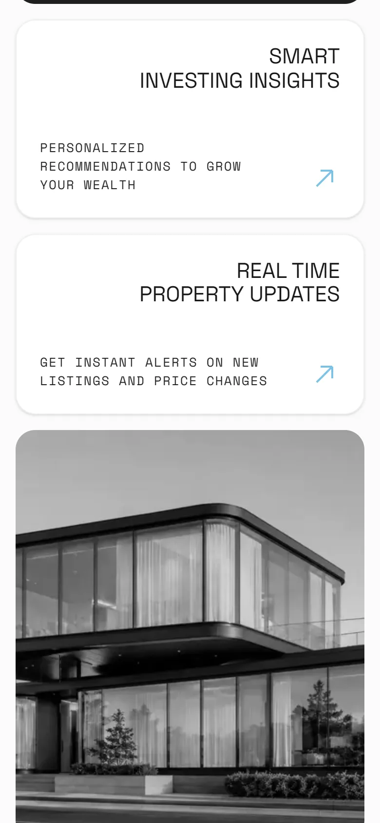
Two layers, one picture
Photograph and cut-out share one image and one box, so the building rises out of its own picture instead of floating over it.
Sticky with an overlap
The work section slides up over the features and holds its title pinned behind the projects, with no extra scroll spent.
One page
Who, what and proof in a single scroll; the listing engine is the part a real agency brings.
What was delivered
A complete one-page concept, designed and built from a blank file and live for anyone to scroll.
- The one-page site, server-rendered
- The building-out-of-the-frame hero
- Count-up figures and feature cards
- The pinned work section with three projects
- Reduced-motion fallbacks throughout
- Hosting on Vercel
Result
City Arcade is a concept, so there are no sales or traffic figures to report and the numbers on its page are part of the fiction. What it does is the job it was built for: it is the site we open when an agency asks what their website could be, and it answers in one scroll.