- Client: Los Santos Barbershop
- Sector: Barbershop, Nicosia
- Year: 2025
- Services: One-page website, booking
- Pages: One
Los Santos Barbershop
Los Santos is a barbershop in Nicosia run by Fahed, a master barber cutting since 2015. Classic cuts, beard sculpting, hot-towel shaves, and a 4.9 rating from the people who sit in his chair.
The shop had a reputation and a full book of walk-ins. What it did not have was a place online that looked as sharp as the fades, said what a cut costs, and let a new client book without a phone call.
Overview
A barbershop does not need a website with ten pages. It needs one page that answers the four questions a new client has before they walk in: what do you do, what does it cost, is it any good, and how do I get a slot. Los Santos came to us with a strong Instagram, a Google listing full of five-star reviews, and no site at all.
The brief was a single page that carries the shop’s character, puts the prices on the table, shows the reviews, and makes booking the obvious next step on every screen.
Who they are
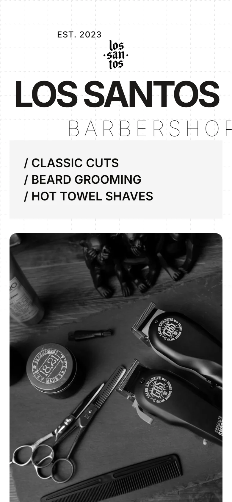
A premium barbershop in Nicosia, est. 2023, run by Fahed: precision cuts, beard grooming, hot-towel shaves, for adults and kids.
What they came with
A loyal client base, a 4.9 rating across dozens of Google reviews, a good Instagram, and no website.
What they needed
One page that looks the part, states the prices, shows the proof, and books a chair without a phone call.
The problem
The business problem was friction. Someone new to Nicosia searches for a barber, finds the Google listing, likes the reviews, and then has to call or message to find out a price and get an appointment. Some of them do. Most of them pick the shop whose site already told them.
The second problem was positioning. Los Santos charges a fair price for a premium cut, and without a site that looks premium the price reads as expensive rather than as worth it. The type, the photography and the pace of the page had to do that work before a single word of copy did.
Design concept
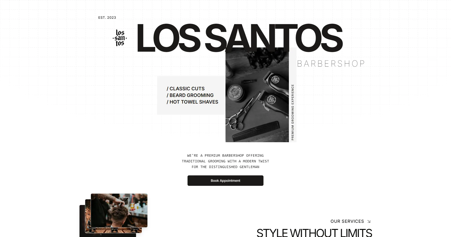
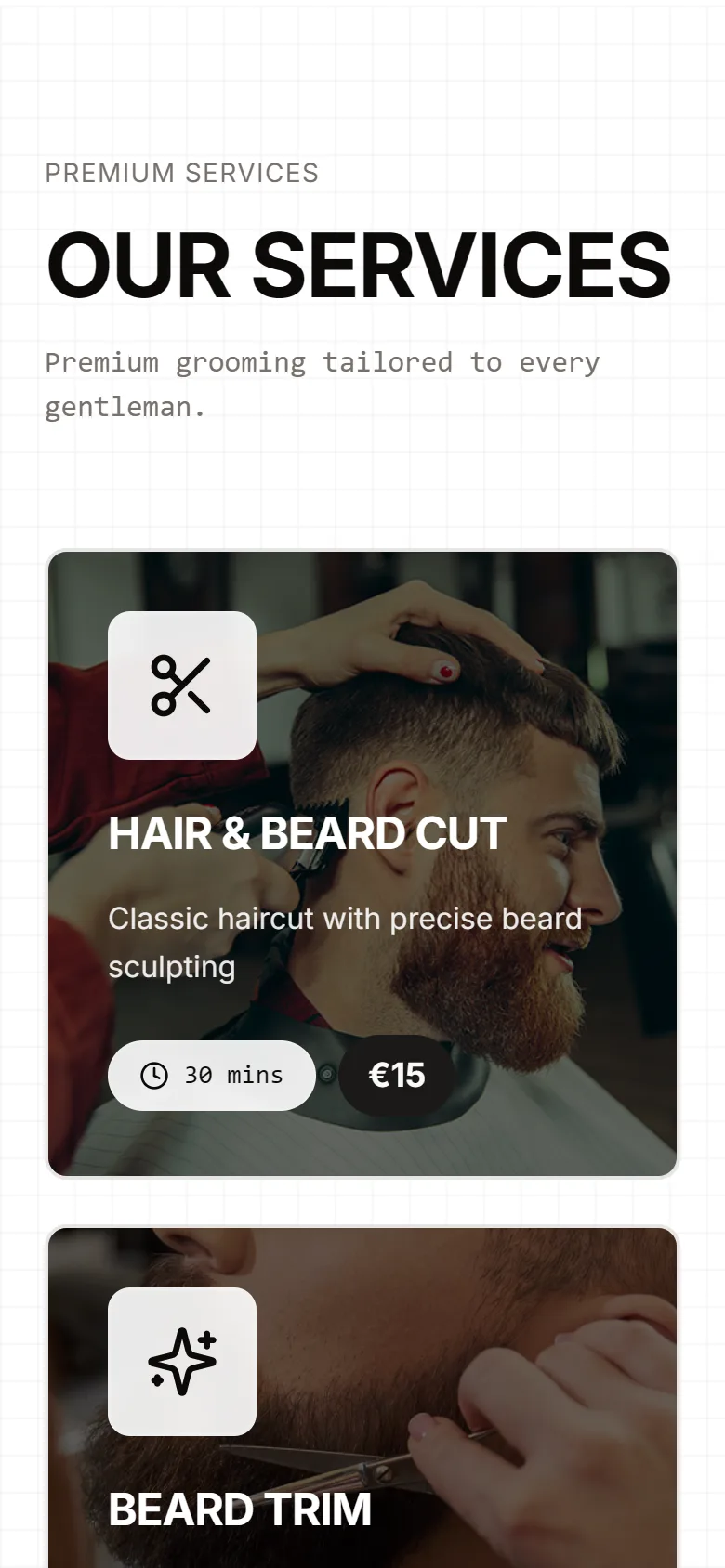
The concept is the shop itself: black, white, sharp edges, a monospaced voice for the small print like a price list pinned by the mirror. The name is set huge at the top, the three services listed under it like a menu, and one button. Nothing else competes for the first screen.
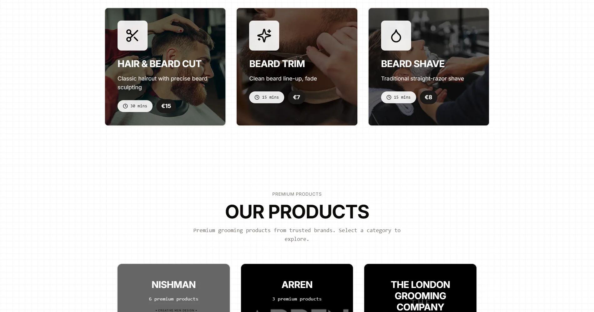
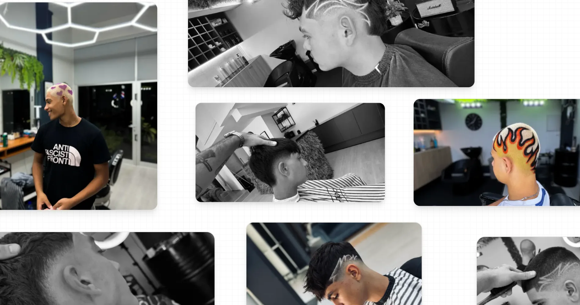
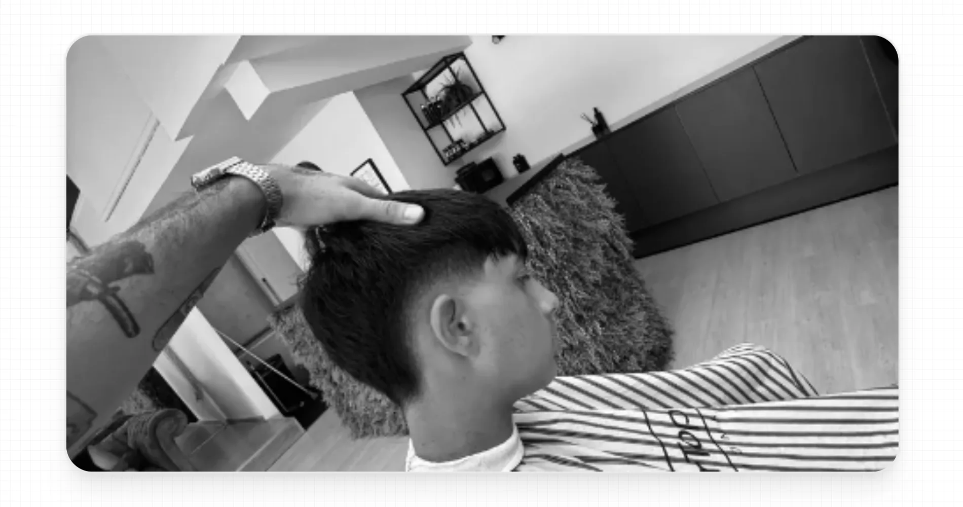
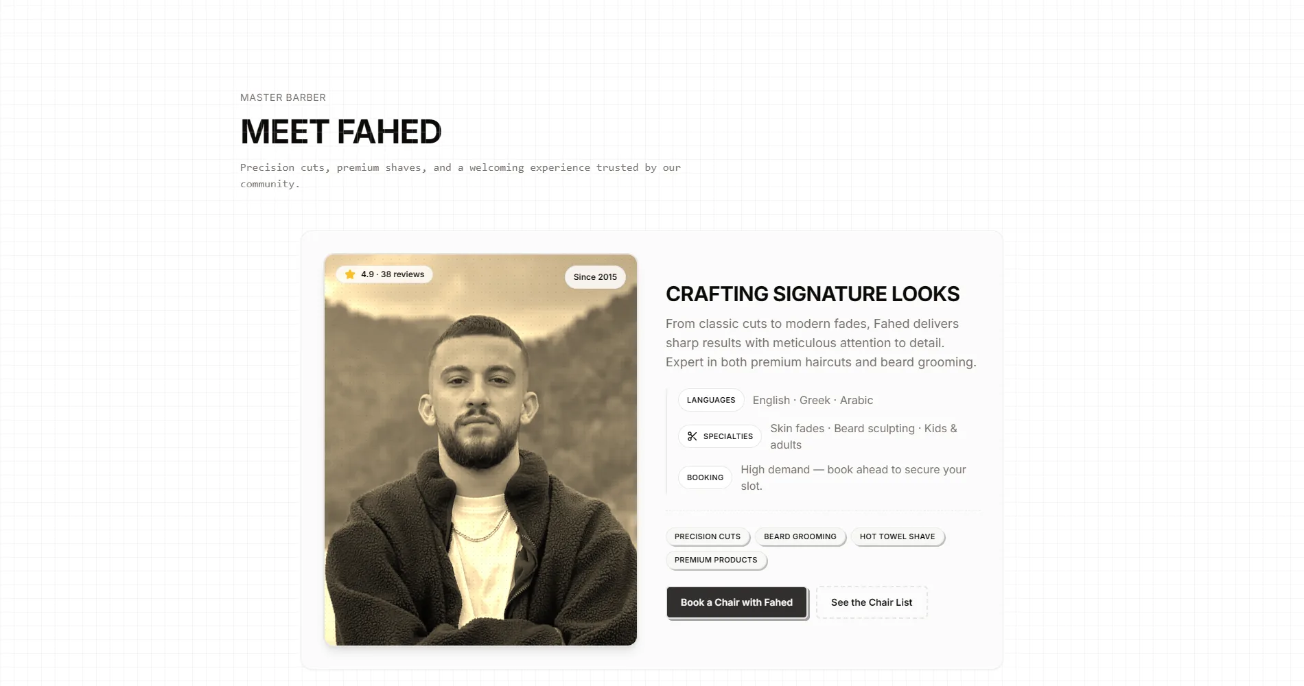
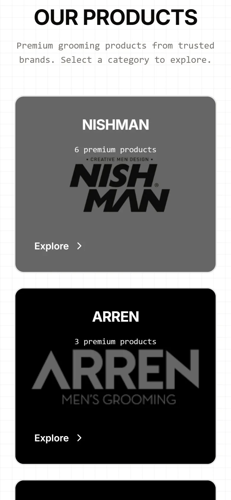
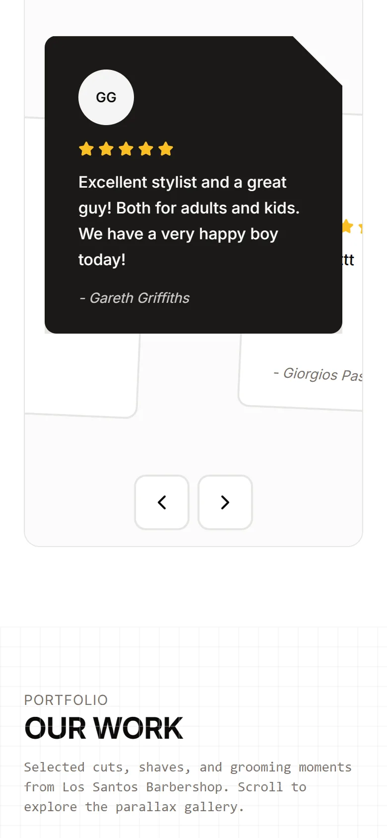
Below it the page is a sequence of short rooms: services with prices and durations, the products on the shelf sorted by brand, the reviews written out with the names, a parallax gallery of the work, and Fahed himself. Every room ends where a booking button can be reached.
A price list, not a brochure
Every service has a price and a duration on the page. It is the most-read part of the site and it was designed as such.
Reviews as text
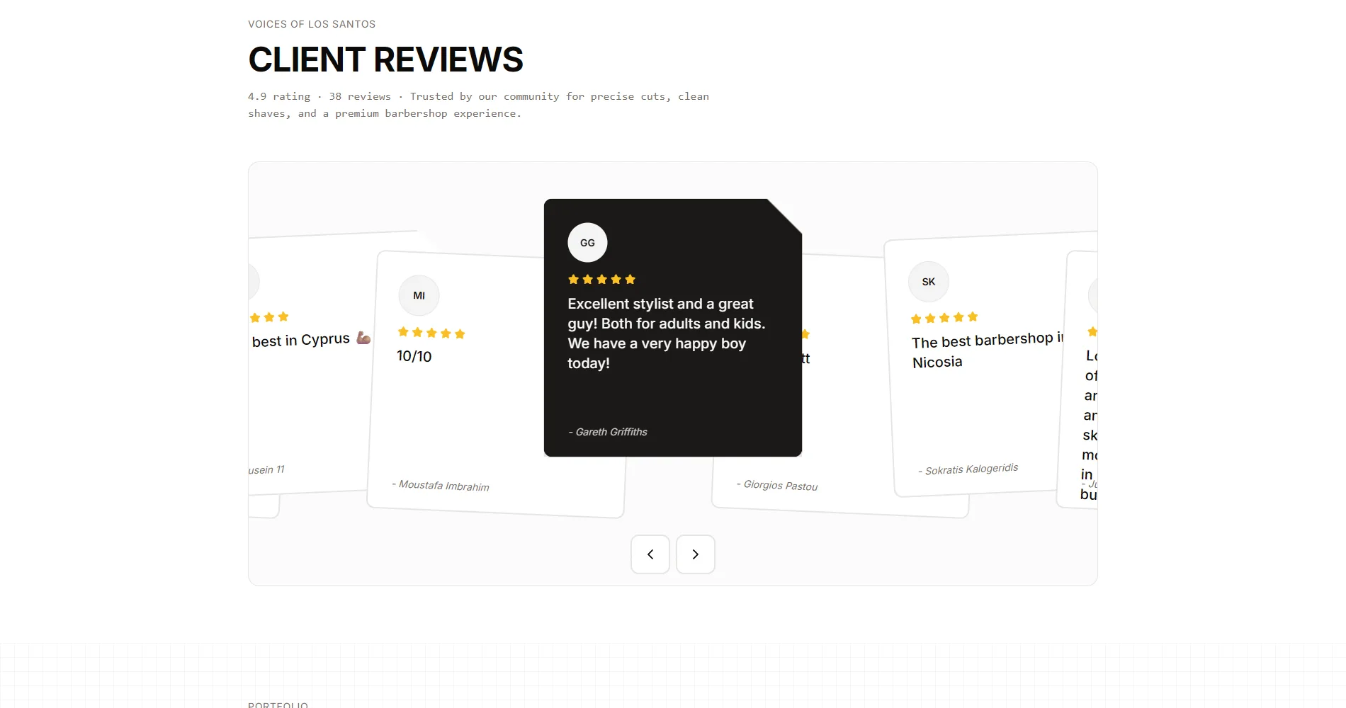
The Google reviews are on the page as sentences with names, not as a star widget. A crawler reads them, a person believes them.
One button, everywhere
Book Appointment is the only call to action, and it recurs at the end of every section.
Development
A Next.js single page, rendered on the server, with the motion layered on top: the gallery’s parallax, the section entrances, the counters. The whole site is one route, which is exactly right for a business with one location and one thing to say.
One route, many rooms
The page is built as a sequence of sections with their own anchors, so the menu, the reviews and the booking link are all deep-linkable from Instagram and Google.
Booking, straight through
The booking button opens the shop’s scheduling flow directly. No form of our own in between, no email that has to be answered.
The parallax gallery
The portfolio scrolls at a different rate from the page, driven off the scroll position, transform-only, so it stays smooth on a phone.
Light on the phone
Most clients open the site on a phone from Instagram. The stills are served per breakpoint and the page is under a second to first paint on a mid-range device.
Key decisions
The hardest call was what to leave out. A first draft had an about page, a gallery page and a contact page. Each one was a place for a visitor to get lost between the price and the booking button. The final site is one page, and the booking button appears in every section, so the distance from any sentence to a booked chair is one scroll.
The second decision was to write the prices in. Many barbers keep prices off the site to avoid comparison. Los Santos is not the cheapest in Nicosia and the page says what a cut costs anyway, because a client who books knowing the price shows up.
One page, on purpose
Every extra page was a place to lose someone between the price and the button.
Prices on the page
A client who books knowing the price shows up. The comparison risk was worth it.
The barber on the page
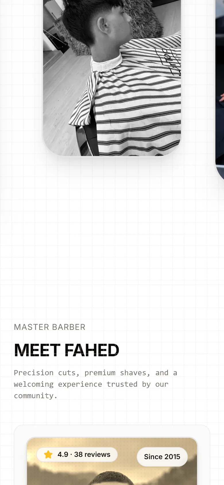
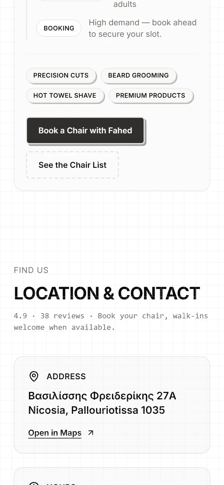
Fahed’s section (since 2015, the languages he speaks, what he specialises in) is the trust the reviews point at.
SEO
A one-page site ranks on one thing, so it was pointed at one thing: barbershop in Nicosia. The title, the heading, the description and the structured data all say it. The reviews are on the page as text with their rating and count, which is what lets a search engine show the stars next to the listing.
- One primary term: barbershop Nicosia
- Server-rendered page, all copy in the HTML
- Structured data for the business, the services and the reviews
- Reviews and ratings as text on the page
- Section anchors that Google and Instagram can deep-link
- Stills sized per breakpoint
What was delivered
One page, designed and built from a blank file, wired to the shop’s booking flow, hosted and handed over.
- The one-page site with seven sections
- Services and products with prices
- Reviews section fed from Google
- Parallax portfolio gallery
- Booking button wired to the scheduling flow
- Structured data, metadata, hosting
Result
The site went live in 2025 and is the address on the shop’s Google listing and Instagram. We do not have booking numbers from Fahed to publish, and we will not invent them. What changed is measurable on the page itself: a new client now sees the price, the reviews and the button on one screen, and books without a message.