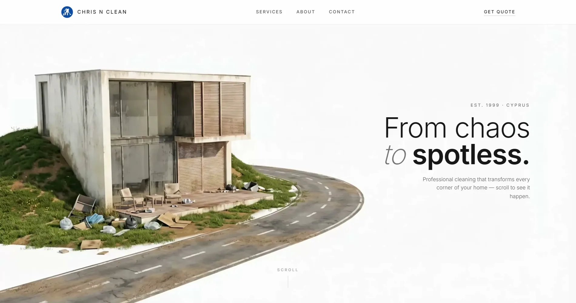
- Client: Velricon
- Sector: Financial advisory, Cyprus
- Year: 2025
- Services: Web design, development, SEO
- Pages: Nine
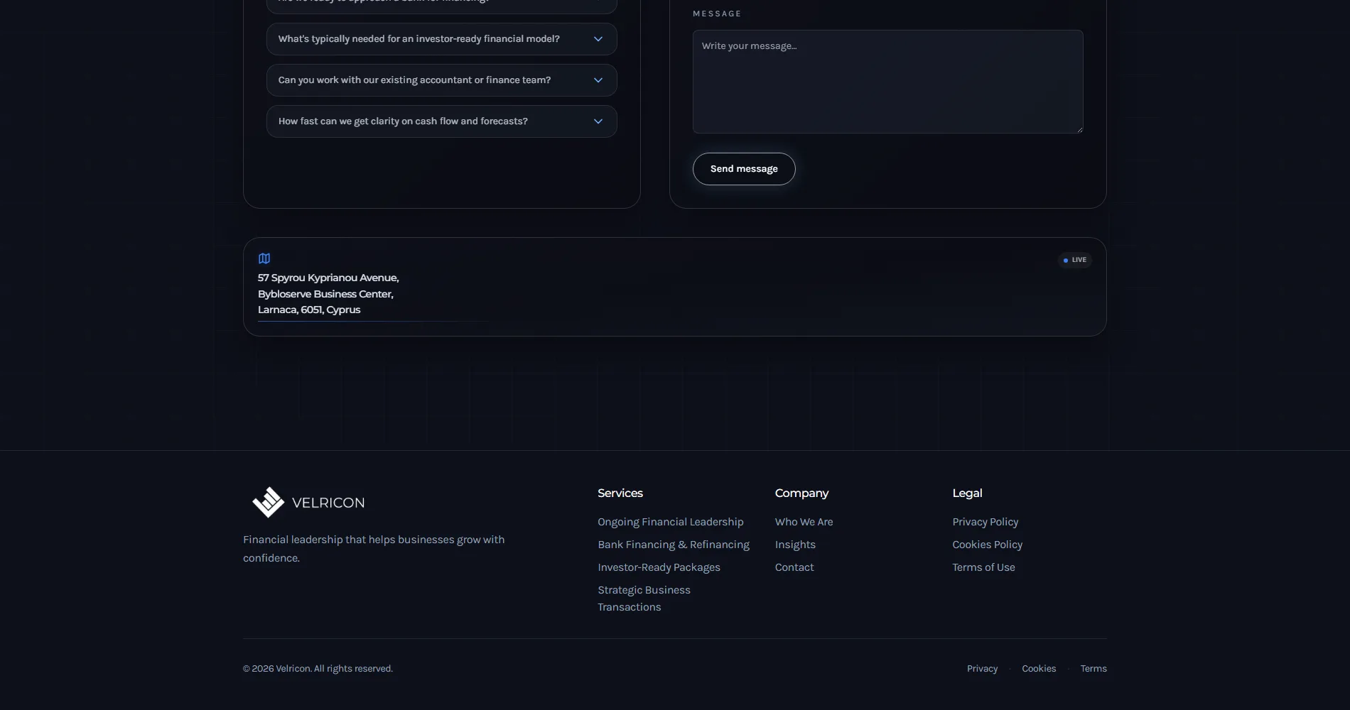
Velricon
Velricon provides senior financial leadership to businesses in Cyprus: the analysis, the reporting, the projections and the conversations with banks, investors and buyers, without the business hiring a full-time CFO.
It is a firm whose product is judgement, and its website had to carry that: composed, precise, quick to understand, and unmistakably senior. Nothing on it could look like a template.
Overview
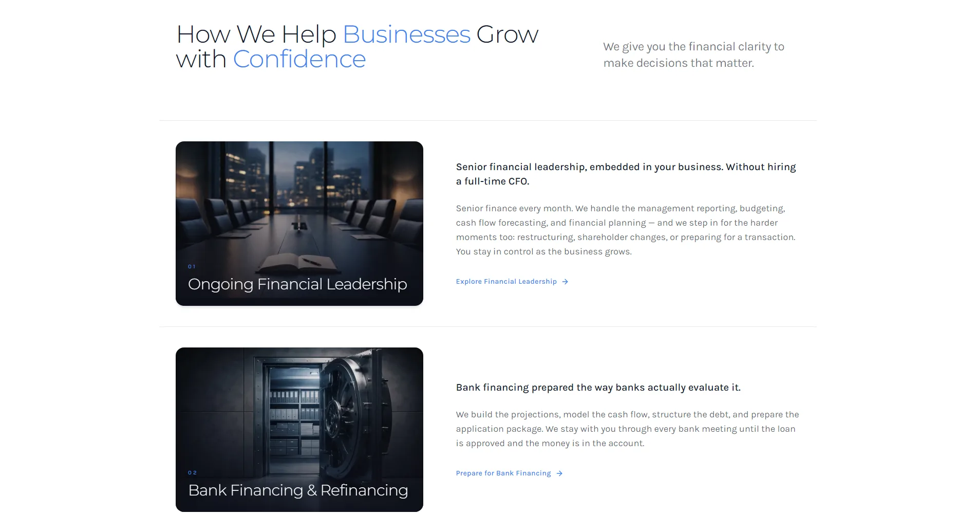
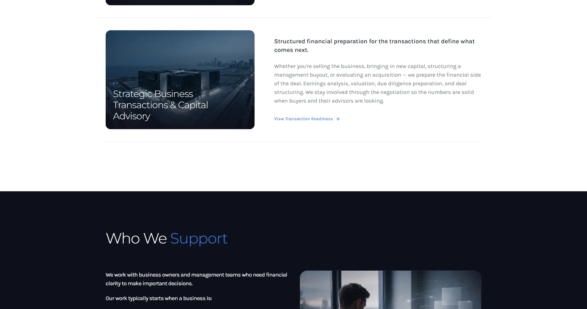
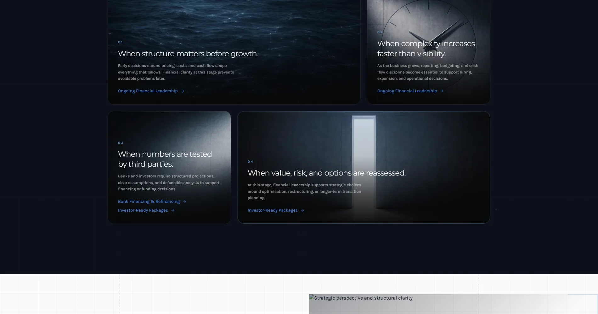
Velricon came to us with a clear service and an unclear site. The firm does four things (ongoing financial leadership, bank financing, investor-ready packages, and the financial side of transactions) and does them for owners who are about to make a large decision. The old site described the firm. It did not describe the decision the reader was facing, and so it did not get read.
The brief was a site that speaks to the owner at the moment of the decision, sets out the four services as four doors, and makes the first conversation easy to start.
Who they are
Senior finance for businesses in Cyprus: reporting, forecasting, financing, investor and transaction preparation.
What they came with
A strong practice, referrals by word of mouth, and a site that described the firm rather than the reader’s problem.
What they needed
A site that reads as senior, sorts the work into four services, ranks for what owners search, and starts conversations.
The problem
The business problem was trust at a distance. A business owner preparing for a bank loan or an investor round is looking for someone senior, and decides in a minute whether a firm is. The old site made that minute hard: generic language, no structure that matched the decisions people actually face, and a contact path that asked for a form before it had earned one.
The second problem was search. Owners in Cyprus type specific things (CFO services, bank financing preparation, investor package) and none of those searches led to Velricon. The firm grew by referral and had no way to be found by someone who had not been told the name.
Design concept
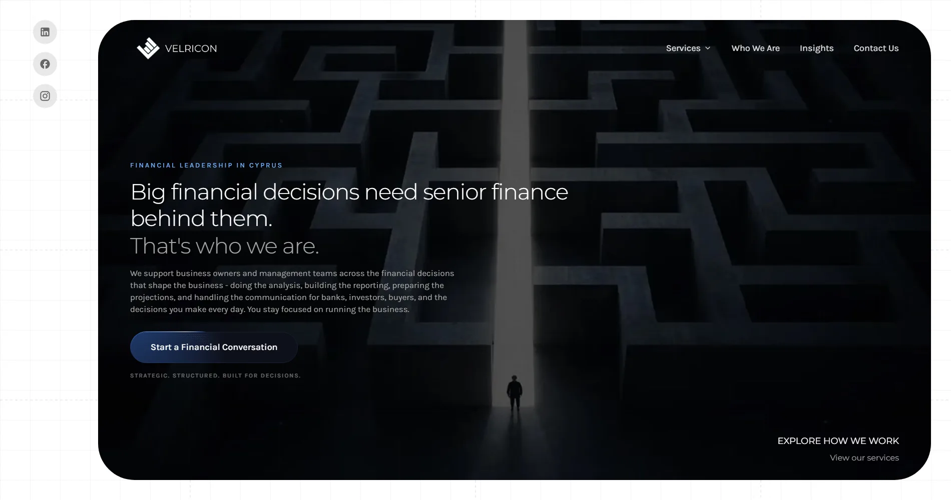
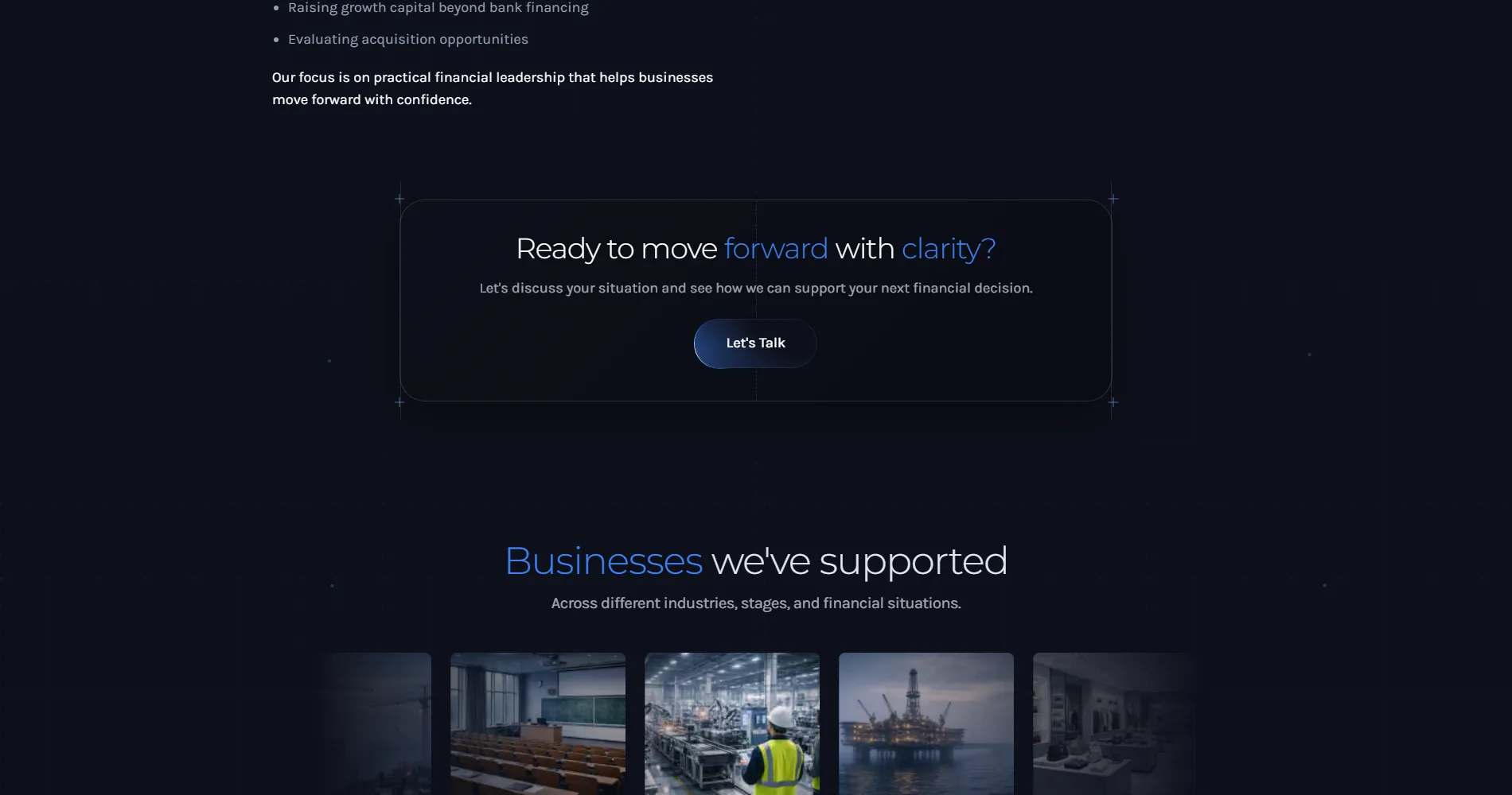
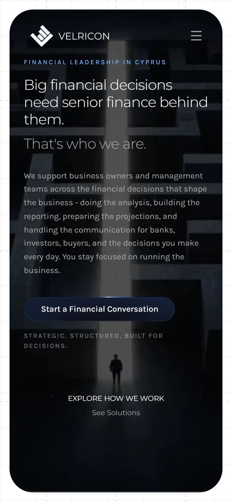
The concept is composure. A restrained palette, generous space, type set with the confidence of a firm that does not need to raise its voice. The homepage opens on one sentence (big financial decisions need senior finance behind them) and the rest of the page earns it: three counters, four services stated as what they do for the owner, and one calm invitation to start a financial conversation.
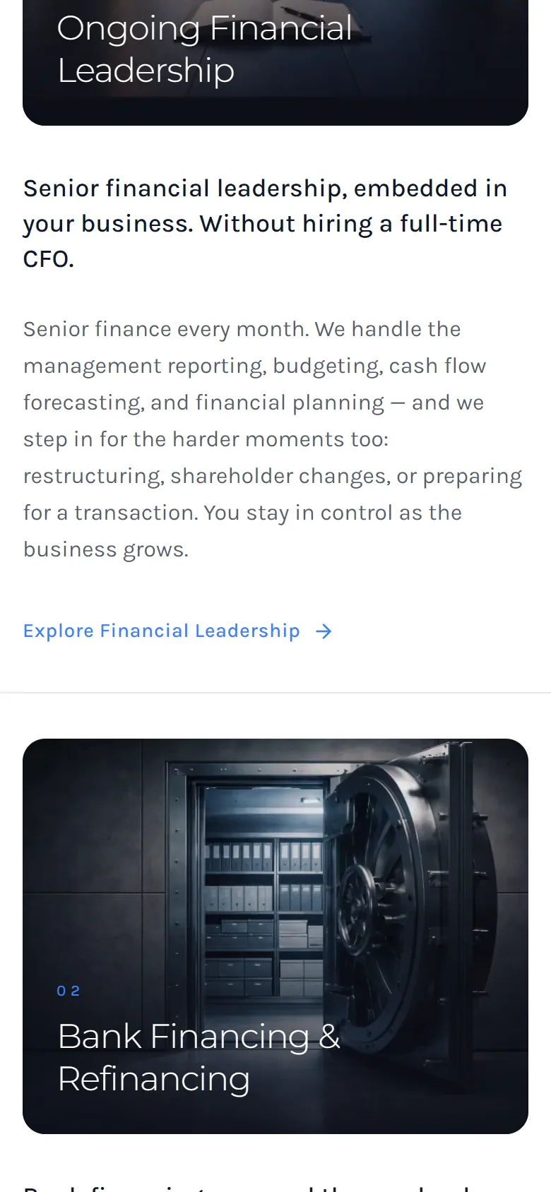
Each service is a chapter of its own, written for the decision it serves. Bank financing is written for the owner about to walk into a bank. The investor package is written for the owner about to raise. The site does not explain finance; it explains what happens next.
Written for the decision
Every service page is addressed to the owner at the moment they need it, not to a general reader.
Numbers that count up
Three counters (decisions executed, industries, years) arrive as the page does. Quiet proof, no badges.
A conversation, not a form
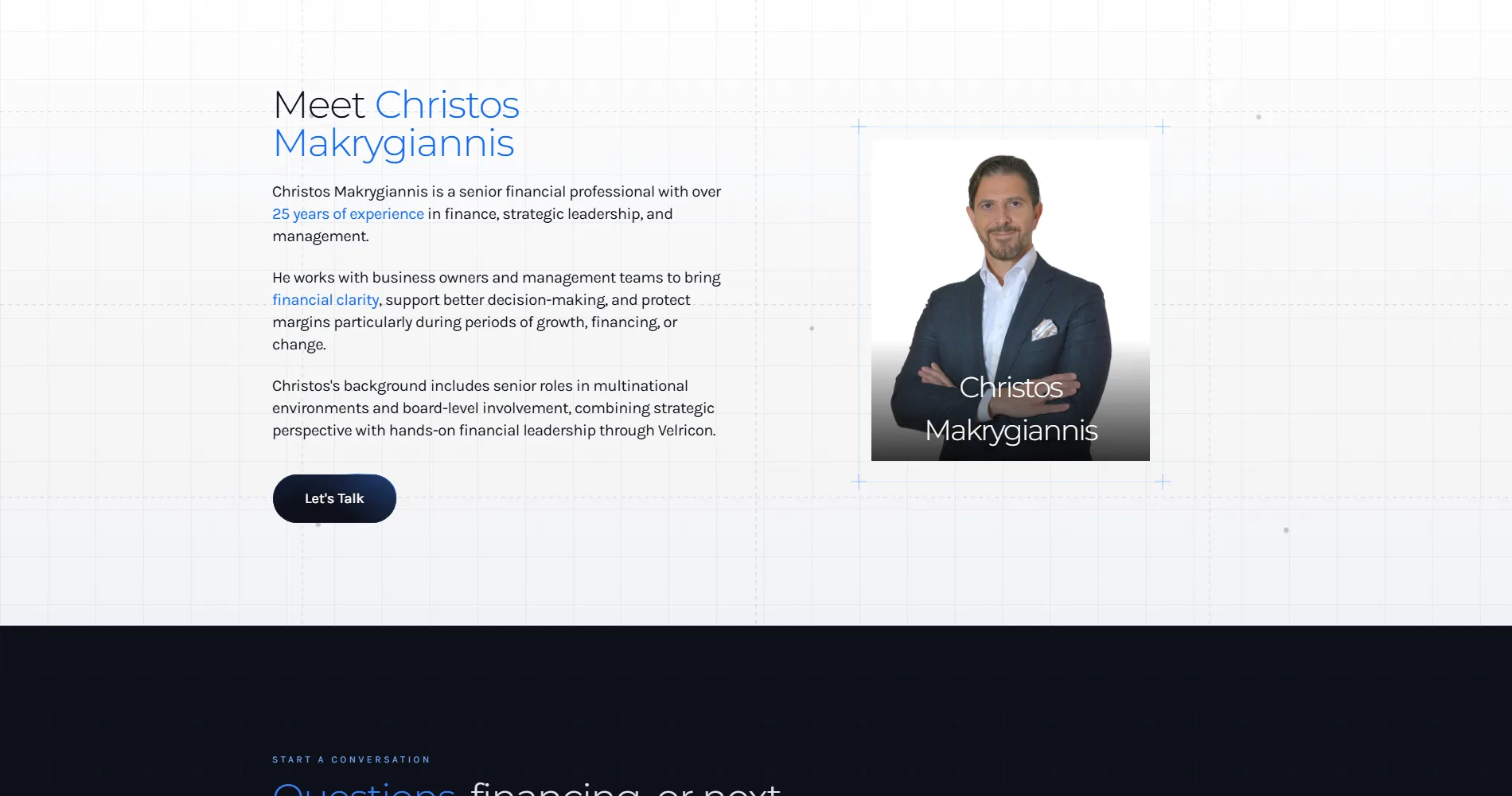
The call to action is to start a financial conversation. The form exists, but the language does not lead with it.
Development
A Next.js site with every page rendered on the server and styled with a strict token system, so the composure holds on every page rather than only on the home. The motion is restrained by design: entrances, the counters, a handful of transitions, nothing that competes with reading.
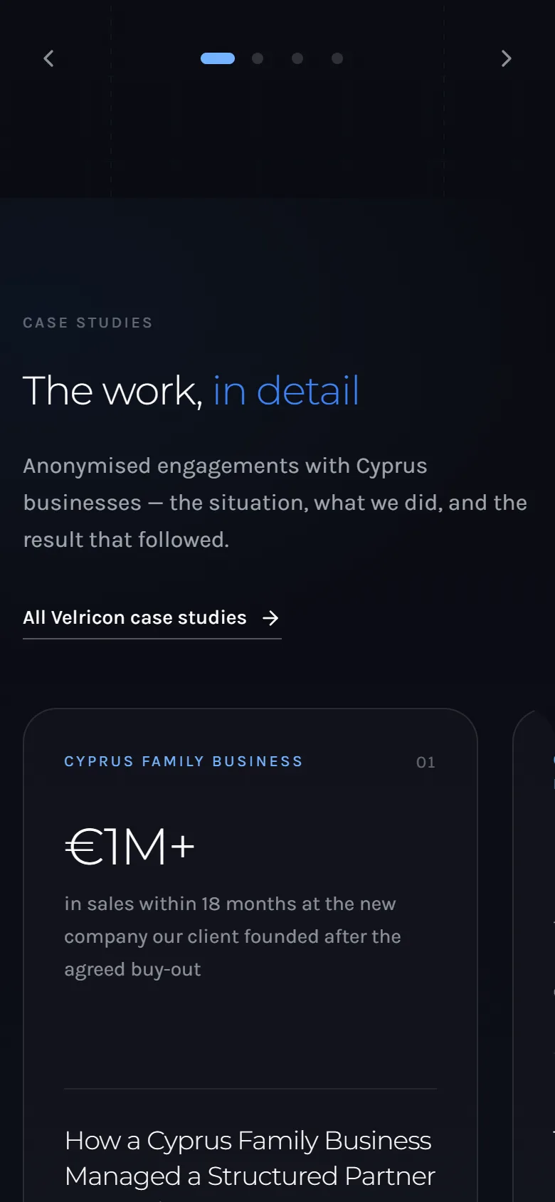
Four service pages, one template
The services share one structure (the decision, what we do, what you get, the invitation) so they read as a set and are easy to extend.
Insights
A writing section built for the firm to publish on the questions its clients ask, each post a page that can rank on its own.
The counters
The three figures count up once, when they enter, and never again. The numbers are in the HTML before any script runs.
Built to be maintained
Copy, services and posts are structured content the firm can edit without touching layout.
Key decisions
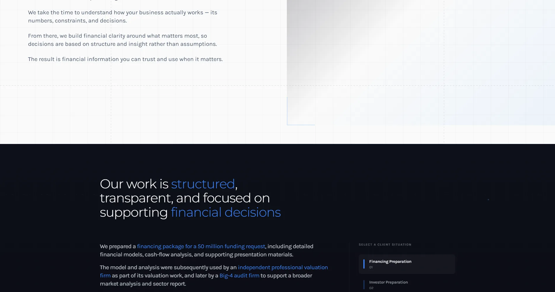
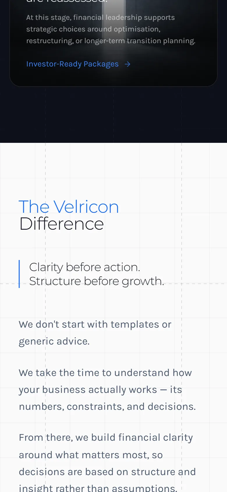
The hardest call was tone. Financial sites default to two registers, the corporate and the startup, and Velricon is neither. The type is set light, the sentences are short, and the site never uses a word the owner would have to look up. Seniority is shown by what the site does not do.
The second decision was structure. The four services could have been one page with four headings. They became four pages, each written for its own decision and each able to rank for its own term, because the owner searching for bank financing help does not want to scroll past investor packages to find it.
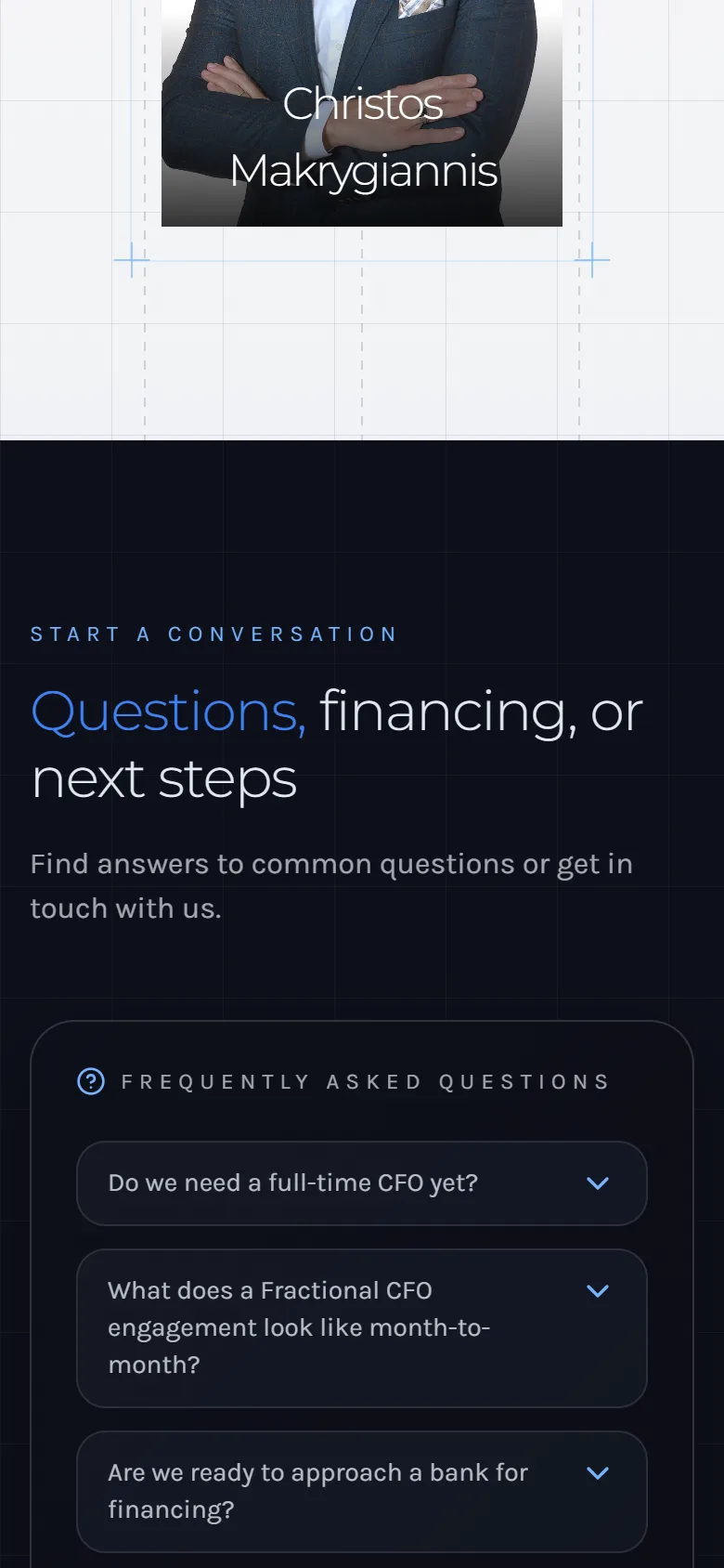
Quiet over loud
Light type, short sentences, no jargon. The confidence is in the restraint.
Four pages, not four headings
Each service ranks and reads on its own, for its own decision.
The sentence first
The homepage leads with one line about the reader, not a paragraph about the firm.
SEO
The keyword work came before the copy. The terms that matter are the ones an owner types at the decisive moment: CFO services Cyprus, financial leadership, bank financing preparation, investor package. The homepage carries the first two; each service page owns its own. Every page is server-rendered, every heading says what the page is for, and the insights section gives the firm a way to keep earning new terms.
- Keyword map: one primary term per page
- Server-rendered pages, all copy in the HTML
- Structured data for the organisation and the services
- Titles and descriptions written per page
- Insights section for ongoing content
- Contact and location data as text
What was delivered
A complete corporate site, designed and built from a blank file, with a content structure the firm maintains itself.
- Homepage with the opening sentence and the counters
- Services hub and four service pages
- Who we are
- Insights, the writing section
- Contact with the conversation form
- Structured data, metadata, hosting and analytics
Result
The site went live in 2025. Velricon has not shared enquiry or ranking figures for publication, and we do not report numbers we have not been given. What the page can show is the change in kind: the firm is now described by the decisions it serves, each service can be found on its own, and the first step is a conversation rather than a form.